Inspiration
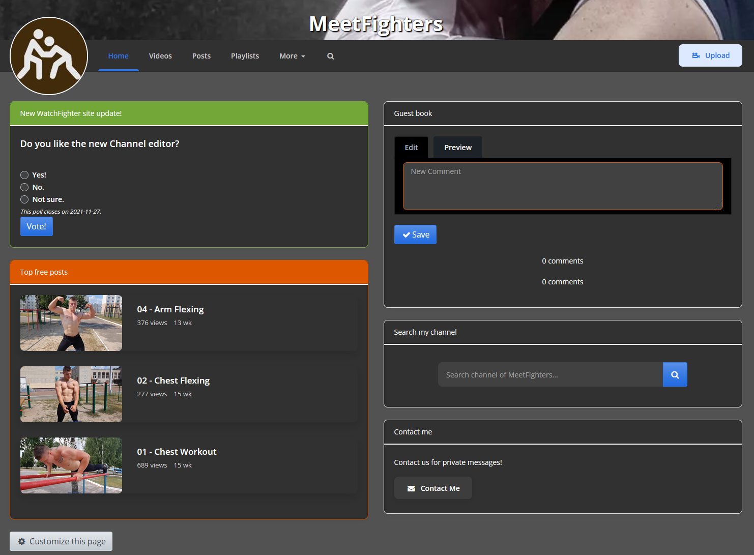
Here is some inspiration to help you get started.Same channel, same content, 3 different layouts.
The zoom level of the channel is adjusted.
1) Focus on your videos
A video focus layout with a subscription option, start off with your 'latest videos' panel on the right, followed by two 'picture' panels on the left, use the picture pannels title box to tease your next releases like "Next week Me vs him" then upload some pictures to spice up the home page and teasing the next fight. Use the other picture pannel to highly the video after that. Below the image, boxes add a poll: "What you like to see next?" A)More wrestling, B)More Gutpunching. To let your viewers interact with your page.
Back on the right, add your "Most soled" videos, and below that, highlight your Channel subscription offer. Finish off with your guest book.
2) You are the content!
Start off with a large single picture panel showing you from the best side. On the other side, use the "my stats" panel to say something about you. Use more picture panes to show different parts of you or your life. Add the 'Message me' panes to encourage private conversations with your viewers. And display the 'Tip me' panel to receive money to sponsor you. Finally, add the guest book, followed by a free text field to finish your layout off. Maybe don't forget to the "Highlight Post" pannel to show handpicked videos from your channel, which can be purchased. And don't forget to link your MeetFighters profile if you happen to have one, allowing viewers to follow you around.
3) Another simple layout
As you see, you can use the optional feature as you wish and pick and choose the panels you like and order them to create your personal page!
Related articles:
- Channel editor - Quickstart
- Channel editor - Q&A
- Channel editor - inspiration and examples (this article)
- Channel editor - panel overview
- Didn't find what your looking for? contact us.
